Update on the A.D.A. H.P.I.'s Covid-19 Economic Tracking Poll with a focus on the Rural-Urban divide
Scroll DownWe are revisiting the American Dental Association Health Policy Institute’s Covid-19 Economic Impact poll. This tracking poll began in March 2020 to access the impact Covid-19 has had on practicing dentists. In each wave (biweekly in 2020, monthly in 2021), 4 core questions were consistently asked to participating dentists. We are now 1 year and 23 waves into the tracking poll. In this post, we will take an updated look to see how each state is performing. We will also explore the rural-urban divide that the data has consistently shown to exist.
For a more detailed breakdown of the poll, please see our initial post.
The dental industry is recovering
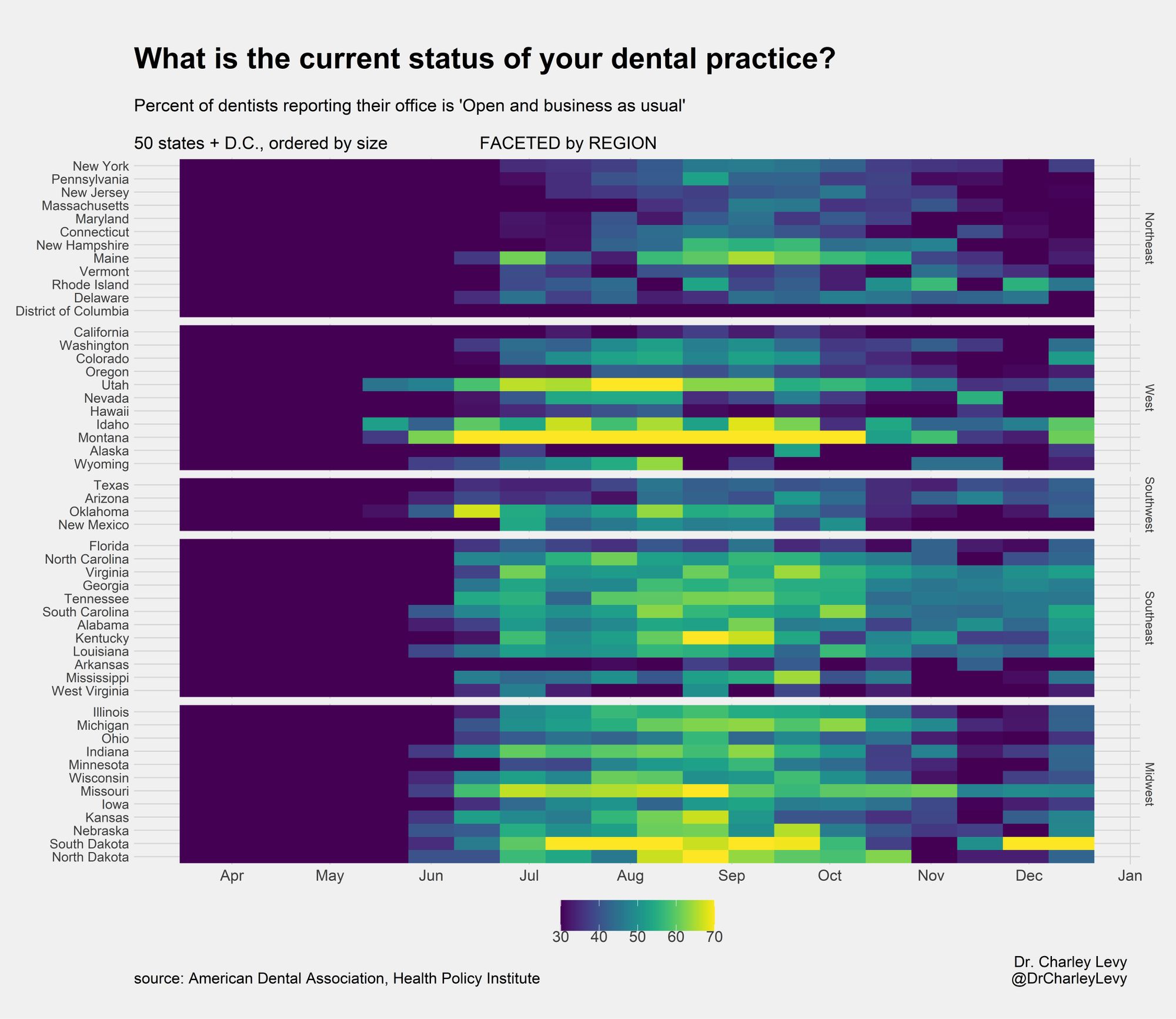
In the first plot (Fig. 1), we look at the question, ‘What is the current status of your dental practice?’. The percent of dentists who responded, ‘Open and business as usual’ is used as our metric. An Exponential Moving Average (EMA) was calculated for each state to smooth the data and mitigate small sample size. In the most recent wave (March 2021), 18 states currently have their highest EMA, with another 7 states having their 2nd highest EMA. March 2021 is the highest performing wave since September 2020.

In the next plot (Fig. 2), we look at the question of 'Patient Volume' and 'Total Collections'. Dentists were asked to select from 6 numerical categories to quantify how they were doing that wave compared to a typical week in their practice. The results for ‘Patient Volume’ and ‘Total Collections’ tracked each other extremely closely, so they were averaged together. Again, an EMA was calculated for each state. In the most recent wave (March 2021), 36 states currently have their highest EMA. In regard to 'Patient Volume'/'Total Collections', states are clearly performing the best they have at anytime during Covid-19.

Rural-Urban divide
In the last plot (Fig. 3), we explore how geography affected the results. Each dentist respondent was placed into 1 of 4 geographical categories: Rural, Suburban, Urban, and Top 20 City. The breakdown of each state in regard to the geography variable can be seen in the left panel. As with the previous plots, we explored the questions, ‘What is the current status of your dental practice’ and ‘% of normal Patient Volume/Total Collections’. The top panel looks at results from all 50 states and D.C.. The middle panel looks at only the 13 states that have a ‘Top 20 City’. A clear trend can be seen where rural dentists performed the best, with suburban dentists following. Urban and Top 20 City dentists consistently performed the worst in the tracking poll.
The bottom panel looks at each state’s results individually. The states are sorted from most Urban to most Rural according to FiveThirtyEight’s Urbanization Index (UI). The UI calculates the average number of people living within a 5-mile radius of each census tract within a state in an effort to quantify how rural or urban a state is. The best performing states are overwhelmingly rural. The most urban states almost uniformly performed poorly. Rural dentists consistently outperformed their colleagues.

Comments