A closer look at the A.D.A. Health Policy Institute's Covid-19 Tracking Poll
Scroll DownOn March 16, 2020, the American Dental Association took an unprecedented step and recommended that all dentists immediately postpone all elective and non-emergent services for a minimum of 3 weeks. On April 1st, the A.D.A. extended that recommendation until April 30th. These were recommendations, not mandates, and were made on the national level. The decisions to allow dentists to re-open for elective procedures were made on the state level, with Alaska becoming the first to do so on April 20th. Over the next 6 weeks, states would continue to allow their dentists to re-open for elective procedures, with Massachusetts being the last on June 8th.
The A.D.A. began to survey dentists the week of March 23rd to understand the impact Covid-19 was having on the profession. This survey, conducted by the A.D.A.’s Health Policy Institute (H.P.I.), was sent out as a biweekly poll to its nearly 70,000 members. The same four questions were repeatedly asked every 2 weeks, serving as a tracking poll that could be analyzed on a national, regional, or state basis. Nine months later, we now have 20 waves of data that we can dissect. We will analyze these 4 questions to see what can be learned from this unique tracking poll. Particular attention will be given to the 1st question as it proved to be the most informative. I contacted the H.P.I. multiple times requesting more specific data or a clarification on their methods and they were transparent and forthcoming in every exchange.
The 1st question, “What is the current status of your dental practice?”, provides us the most insight as to how the dental profession has been faring over the last eight months. Two months into the pandemic (May 18th), just 10.8% of dentists reported being ‘Open and business as usual’ (Fig. 1). One month later, 33.8% responded favorably. By the middle of the summer (July 13th), that number rose to 41.6%, and continued to rise as the summer progressed, peaking at north of 48% by the end of August and early September. The fall has brought a slow and steady decline, dropping to just 32.4% of dentists reporting being ‘Open and business as usual’ in the penultimate wave. The most recent wave showed a moderate uptick (38.5%) that would prove notable if enduring. Only 21 states ever reached 60% in a single wave. Less than half the states (24) reached 55% in two separate waves. Montana served as the high-water mark recording 85% in late August. The states are colored according to their geographical region.

The 2nd question, "Is your dental practice paying staff this week?", proved to be much less informative. Since mid-June, when all states had officially re-opened for elective procedures, only 10 states have averaged below 90% regarding fully paying their staff (Fig. 2). 16 states have averaged 95% or more. During this same period, only 14 states have fallen below 80% in a single wave. This should be viewed as a positive that despite a downturn in other metrics, dental offices overwhelmingly still have the financial solvency to continue to pay their staff. However, this metric is too inelastic to serve as a barometer for how the dental profession is currently faring. With nearly all states north of 90 percent, couples with the small sample size, insights could not be made from this question.

The 3rd and 4th questions asked dentists to categorize their current patient volume and volume of collections into one of six numerical categories ranging from 0 to 100%. For both questions, the H.P.I. changed the answer choices between the 13th and 14th wave (mid-Sept) from being negatively skewed to being positively skewed. The survey went from having three of size answer choices parse different levels of below 25% of patients/collections (<5%, 5-10%, 11-24%) to having three of the six answer choices parse different levels of above 75% (76-85%, 86-95%, >95%). When asked for comment on why they changed the answer selections, the H.P.I. responded that it was in response to economic conditions in practices improving. While conditions had been improving each subsequent wave from April through September, those improvements were decreasing in size. A more honest evaluation of the data would have more likely shown a plateau at this time. Armed with the knowledge of rising Covid-19 cases as the fall transitioned to the winter, a decline could have been reasonably expected. I do not think this change in answers was justified. Both questions received an artificial boost from the more positive framing. This is highlighted visually by a discontinuity between waves 13 and 14 (Fig. 3, Fig. 4). 49 of the 50 states and D.C. showed an increase in the percentage of dentists reporting at least 75% of patient volume from wave 13 to wave 14. The average state had an increase of over 14% in dentists reporting to be above 75%. A similar phenomenon can be seen with the collection data: 49 of 50 states and D.C. increased from wave 13 to wave 14, with an average increase of over 15%. When all four questions are plotted together (Fig. 5), it is clear that the last 2 questions received an artificial boost from the more positive framing. This increase is discordant with the data from the first 2 questions.


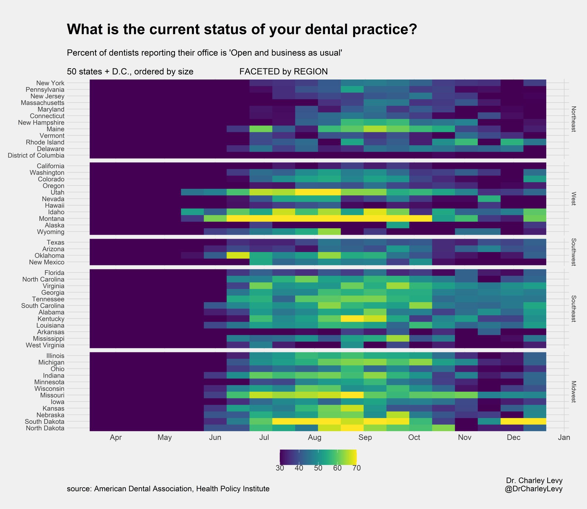
Let’s re-examine the 1st question using the visual of a heat map as an aid. The 50 states and D.C. are sorted alphabetically. This heat map shows the percentage of dentists reporting being ‘Open and business as usual’ for each of the 19 waves in the H.P.I.’s tracking poll (Fig. 6). The range of values go from 0 to 85%. You can see the stark darkness of April and May. Other than this, not much can be gleamed from this heat map. Because of the near complete shutdown in April and May, the range of values is too large for a more discerning analysis of the more recent results. As you can see in the dot plot (Fig. 7), after the initial shutdown, the majority of results have fallen in the range between 30 and 70%. This is the range we are going to focus on moving forward. Visually, this means that 15% will appear the same as 30%, as will 85% appear the same as 70%. More importantly, the difference between 30%, 50% and 70% will be more vivid. This is our intention.


The next heat map adapts that adjusted scale (30-70%) and orders the states by their population (Fig. 8). When looking at this plot, there are 3 main takeaways.

· the largest states have done relatively poorly. Five (California, Texas, New York, Florida, Pennsylvania) of the six largest states are in the bottom 18 in recovery. This was calculated by taking the mean for each state from wave 7 (mid-June, when all states were re-opened) to the most recent wave. The only exception was Illinois, which showed a slightly above average recovery (22nd best).
· some of the smallest states have shown the best recovery. Of the 9 states that have shown the best recovery, 4 are particularly small states (Montana, South Dakota, Idaho, North Dakota).
· Beginning with wave 7 (when all states were officially re-open), we calculated the 8-week rolling average for each state. 13 states currently have their worst 8 week rolling average since the initial shutdown. 27 other states currently have their 2nd worst 8 week rolling average. Despite poor conditions for the last 6 months, the most recent 8-week stretch has been at a worst or near-worst level for the overwhelming majority of states. Although the most recent wave showed some optimism, it is unlikely this upward trend will continue as the winter progresses.
In this next heat map (Fig. 9), the states are faceted into 5 geographical regions (Northeast, Midwest, Southeast, Southwest and West). This allows us to explore for any regional trends that have occurred across our country. In this regional exploration, each state’s ‘Dental Footprint’ was calculated to ascertain how much weight each state should be given relative to every other state (Fig. 10). The ‘Dental Footprint’ gave equal weight to three variables on the state level: population, number of dentists, and number of survey respondents. This best captures each state’s contribution from a public health (population) and industry (number of dentists) perspective while also giving weight to states that had more survey participants. For example, in comparing California to Wyoming, California has 67x the population, 97x the number of dentists and 40x the number of survey respondents. Correspondingly, California has a Dental Footprint that is 63x as large as Wyoming. In moving from Figure 9 to Figure 11, we scaled each state’s height to correspond to their ‘Dental Footprint’. Figure 11 highlights the vast discrepancy between state's dental footprints. The oversized weight that states such as California, Texas, New York and Florida have compared to some of the smaller states is very apparent.


Of the nearly 70,000 A.D.A members invited to participate in this tracking poll, over 19,000 responded to the first survey. That number would quickly drop to roughly 6000 by the second survey and just over 2700 in the most recent wave. In this most recent wave, 25 states had less than 30 dentists respond to the survey. This diminished sample size created too much noise and made the bi-weekly results of the smaller states too unreliable. To correct for this noise, we aggregated together states within each region that had an insufficiently large ‘Dental Footprint’. The cutoff was made at 2%. States that had greater than a 2% ‘Dental Footprint’ were able to be analyzed on their own. States that fell below that threshold were aggregated together with their fellow smaller states within their region. An effort was made to aggregate states together that were geographically closest to each other. Upon aggregation, each state’s dental footprint was used to give them proper weight in their aggregation. Figure 12 shows this aggregation, now dividing the country into 30 sub-regions. Each sub-region comprised at least 2% and was large enough to be analyzed accurately. In analyzing Figure 12, we see

· the Northeast, West and Southwest have been hit the hardest. Since the initial shutdown, the Northeast (35.7%) and West (36.3%) have been hit the hardest, with the Southwest fairing slightly better (39.6%). The Northeast faired uniformly poorly, with no sub-region topping 41%. The West was more of a mixed bag. The sub-region of Utah-Idaho-Montana-Wyoming did remarkably well (56.8%) but was weighed down by the outsized effect of poorly performing California (31.3%). The Southwest was also uniformly poor, with no sub-region topping 43%.
· the Southeast and Midwest have shown the strongest recovery. The Southeast (46.2%) and Midwest (47.5%) have demonstrated the strongest recoveries since the initial shutdown. The Southeast’s largest state, Florida, faired poorly (37.6%). The other 5 sub-regions within this region all did significantly better, all averaging above 44%. The Midwest, with the exception of Ohio and Minnesota, has also shown a strong recovery. The Midwest’s other 6 sub-regions all averaged above 46%.
The H.P.I. recently announced that as the calendar year turns to 2021, they will be moving their tracking poll from bi-weekly to monthly. We will continue to report on the results to better understand how Covid-19 is affecting the dental industry.
Comments